Northern Disco
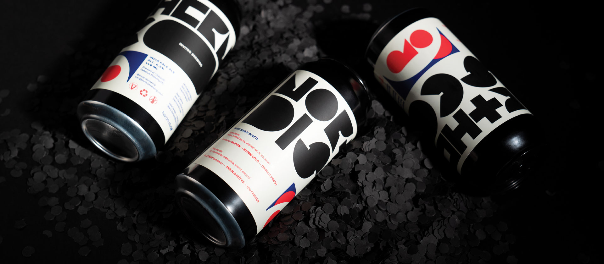
I recently completed a brand new redesign of the craft beer label for @invitrobrewing, and I am excited to share the results! For this project, I experimented with a unique combination of design elements to create a label that stands out from the crowd.
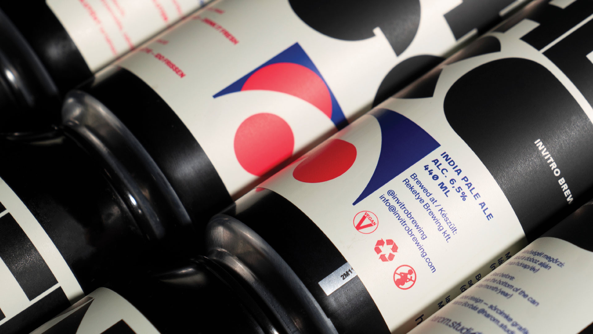
My approach was to use a geometric shape-based lettering style, which I combined with high-level ink traps to create a bold and striking effect. I also incorporated elements from the 90s, such as vibrant colors and bold patterns, to give the label a retro vibe that is both nostalgic and modern.
client: Invitro Brewing
genre: label design and typography
photos by bendeguz csizmadia


The result is a label that is both eye-catching and memorable, with a design that reflects the unique character and flavor of Invitro Brewing's craft beers. Whether on the shelf or in the hands of a customer, this label is sure to leave a lasting impression and help Invitro Brewing stand out in a competitive market.
Overall, we are thrilled with the outcome of this project and believe that our innovative approach to design has resulted in a label that is both visually stunning and highly effective in capturing the attention and imagination of beer lovers everywhere.
Overall, we are thrilled with the outcome of this project and believe that our innovative approach to design has resulted in a label that is both visually stunning and highly effective in capturing the attention and imagination of beer lovers everywhere.


