NSÜ -Nemzeti Sportügynökség
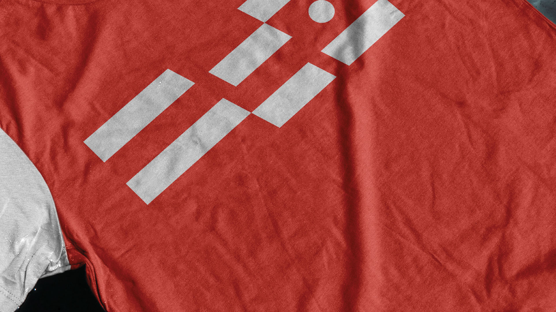
My design proposal for the NSÜ identity and brand concept revolves around an experimental shape/line system that incorporates the N, S, and Ü letters. This concept is meant to create a unique and dynamic visual identity that reflects the agency's mission of promoting and developing national sports.
client: National Sport Agency
genre: branding design
client: National Sport Agency
genre: branding design


The main visual element of the identity is the use of geometric shapes and lines that intersect and overlap to form the N, S, and Ü letters. These shapes and lines are meant to convey a sense of movement, energy, and athleticism, while also creating a distinct and memorable look for the NSÜ brand.
In addition to the main visual element, we also developed a secondary identity element in the form of a mask. The mask is derived from the shape of the N, S, and Ü letters, and serves as a versatile and flexible element that can be used across a variety of offline and online applications. The mask can be used as a graphic element in print materials, or as a digital icon or avatar for social media and other online platforms.
Overall, our identity and brand concept for NSÜ is designed to be modern, bold, and dynamic, reflecting the agency's commitment to promoting national sports and creating a vibrant and active community of athletes and fans.


