Incubator
This page is dedicated to showcasing all ongoing projects, typefaces, concepts, passion projects, and yearly recurring side projects that are in the works. It seems like a design laboratory, these projects are evolving and even adding more content every week/month.
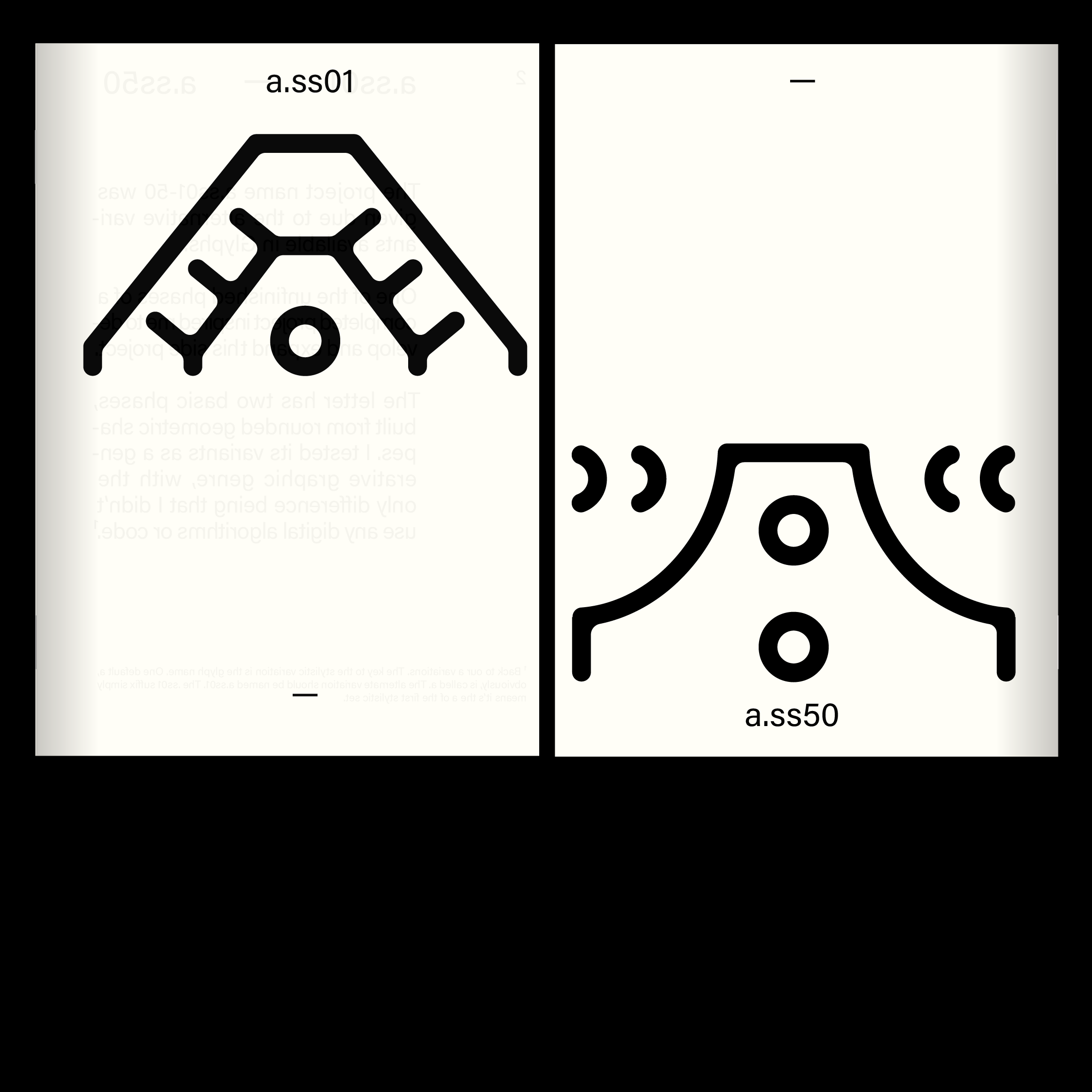
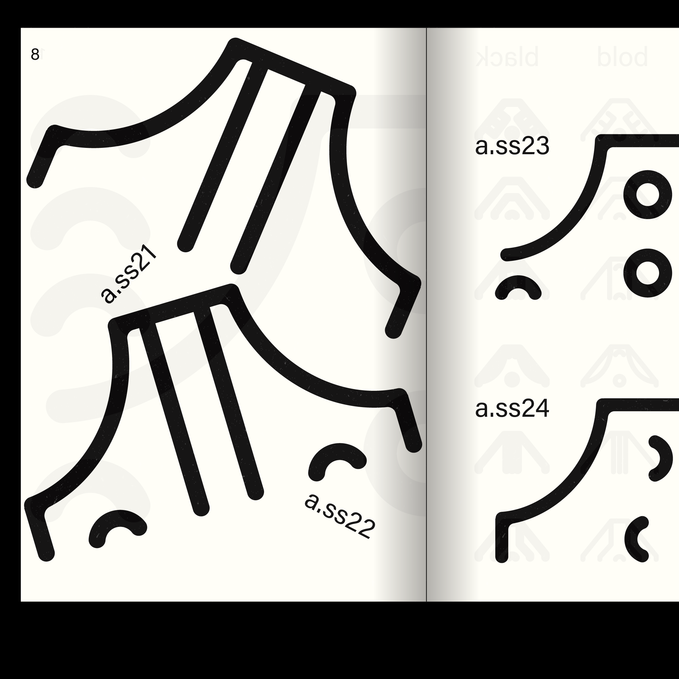

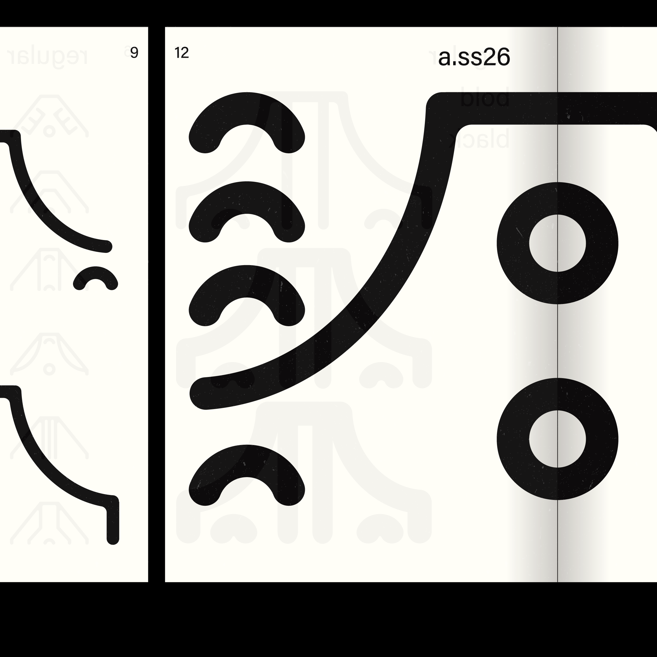
a.ss00-50
The project name a.ss01-50 was given due to the alternative variants available in Glyphs. One of the unfinished phases of completed project inspired me to develop and expand this side project. The letter has two basic phases, built from rounded geometric shapes. I tested its variants as a generative graphic genre, with the only difference being that I didn’t use any digital algorithms or code.
The visual style almost turns into an illustrative phase for each variant, from the formal fusion of which you can discover a simple tribal symbol system. The medium for this is realized in a type specimen, where I have collected the phases of these variants. This letter collection currently only deals with the letter “A.” Ther may be further continuation, but it is not my goal to design the entire alphabet and create a readable system.
The visual style almost turns into an illustrative phase for each variant, from the formal fusion of which you can discover a simple tribal symbol system. The medium for this is realized in a type specimen, where I have collected the phases of these variants. This letter collection currently only deals with the letter “A.” Ther may be further continuation, but it is not my goal to design the entire alphabet and create a readable system.
Soros-dictionary
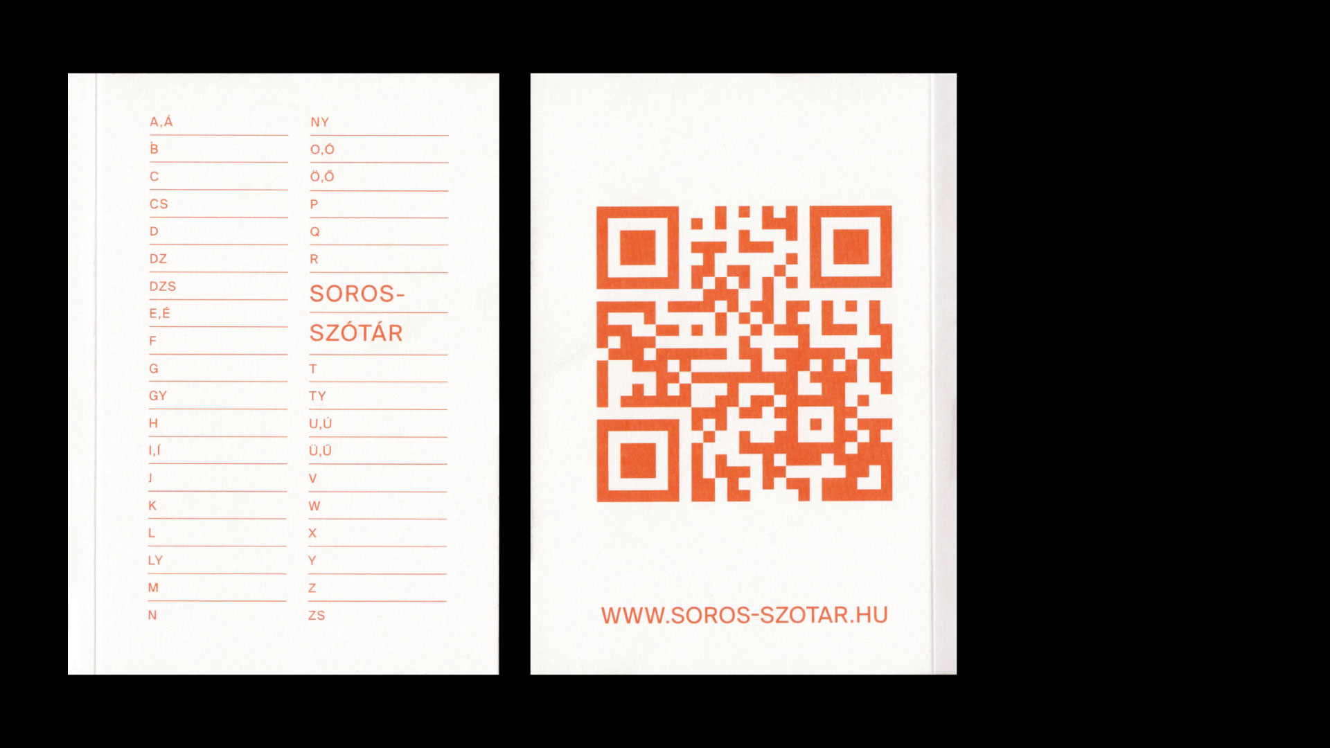
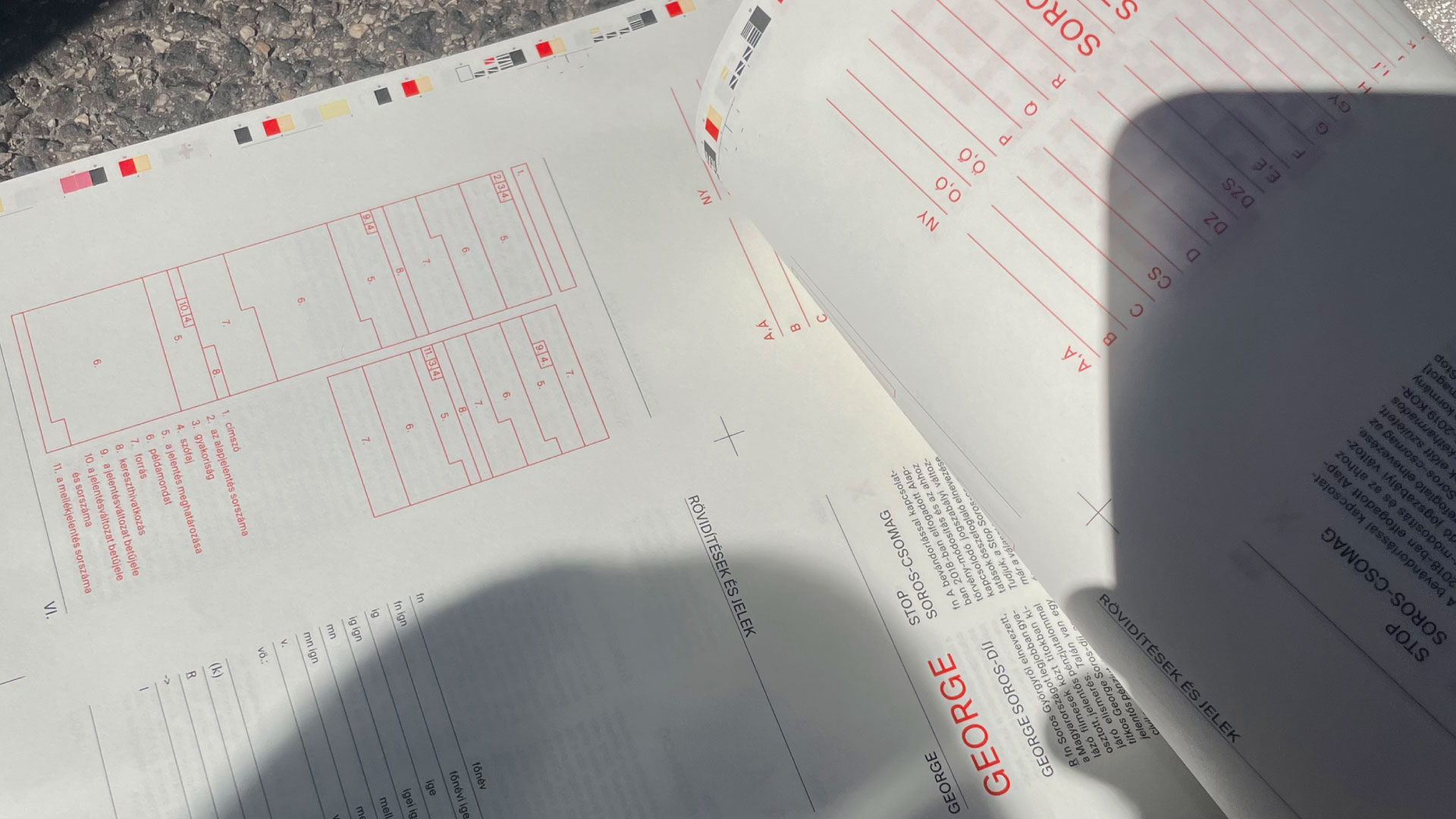
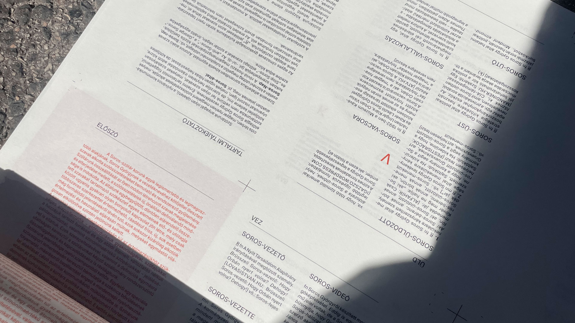
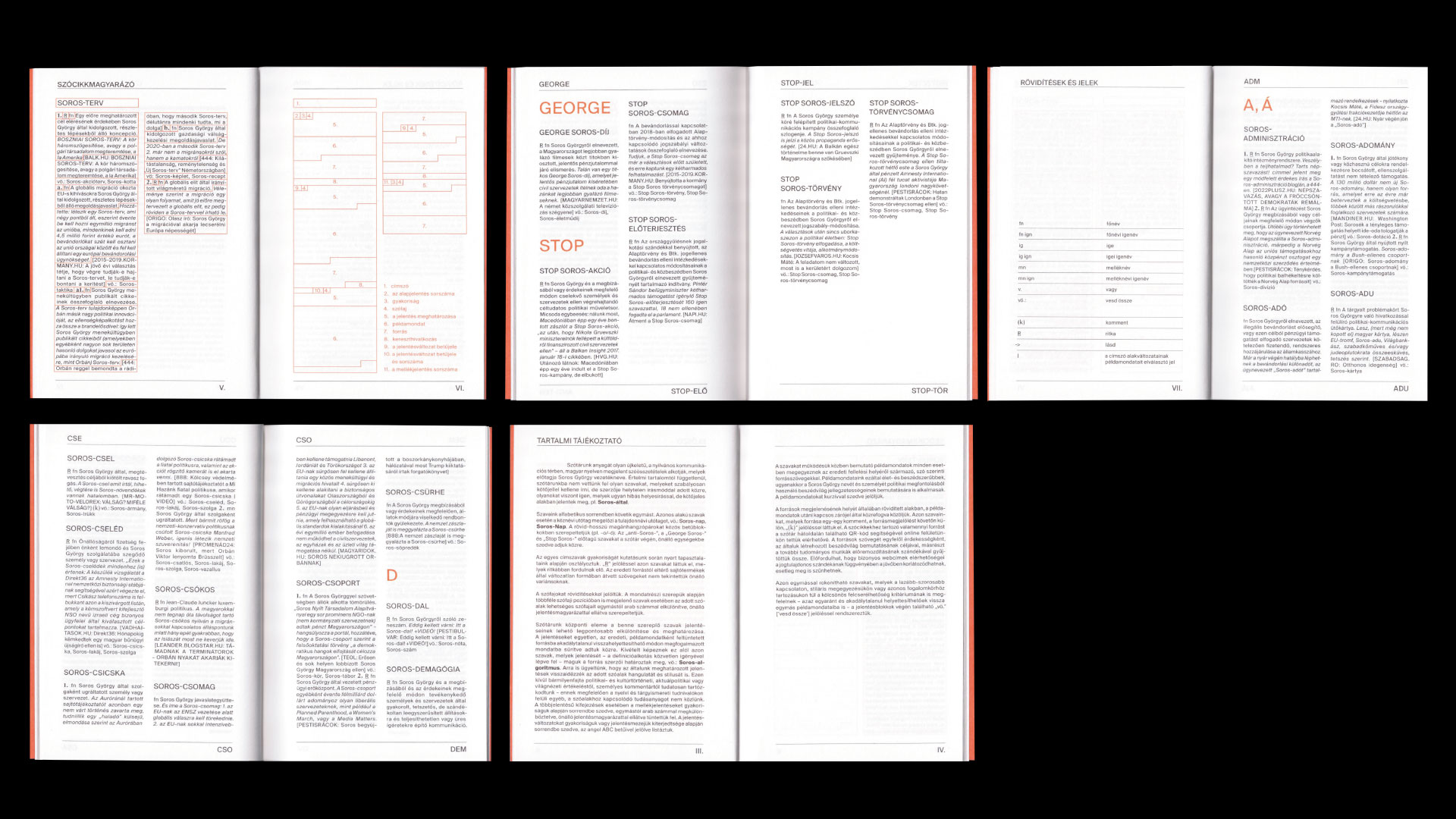
Book and layout design for Soros-dictionary.
‘A compilation of word entries that has been prepared over many long years, encompassing every Hungarian expression that has ever appeared in the domestic press and includes the term "Soros-". One might think it's just a strong joke, but in reality, the dictionary demonstrates just how brutally serious this phenomenon is: in recent years, the act of associating with Soros has grown to such proportions that it can be identified in 1 percent of the entire Hungarian vocabulary.
The book contains a total of 626 word entries, which, based on the approximately 60,000 word entries in the Hungarian Language Comprehensive Dictionary of Meanings, amounts to about 1 percent of the Hungarian vocabulary. This means that since around 2015, when active series production began, approximately 1 percent of the entire Hungarian lexicon has been serialized.’ Telex

Zullah
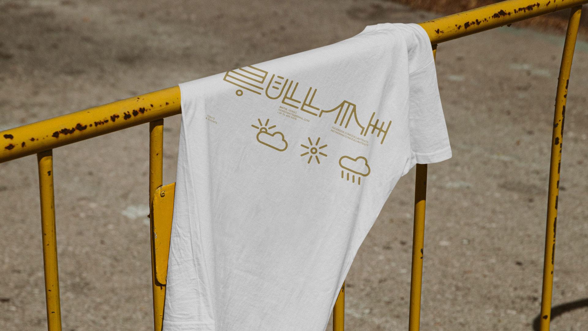
Zullah or Zillah means "shelter".
The concept of the design was influenced by the Arabic origin of the word, although during the planning phase, we veered more towards a tribal vibe and created the following logo variations by designing a fictional yet readable character set.
FlexTent construction and rental for the best events. Ecological footprint: 0
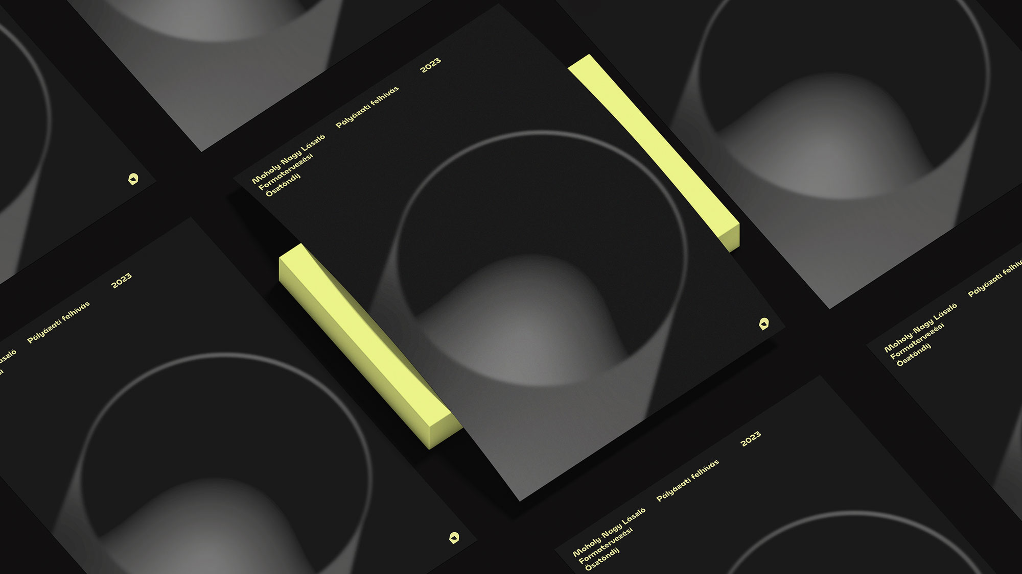
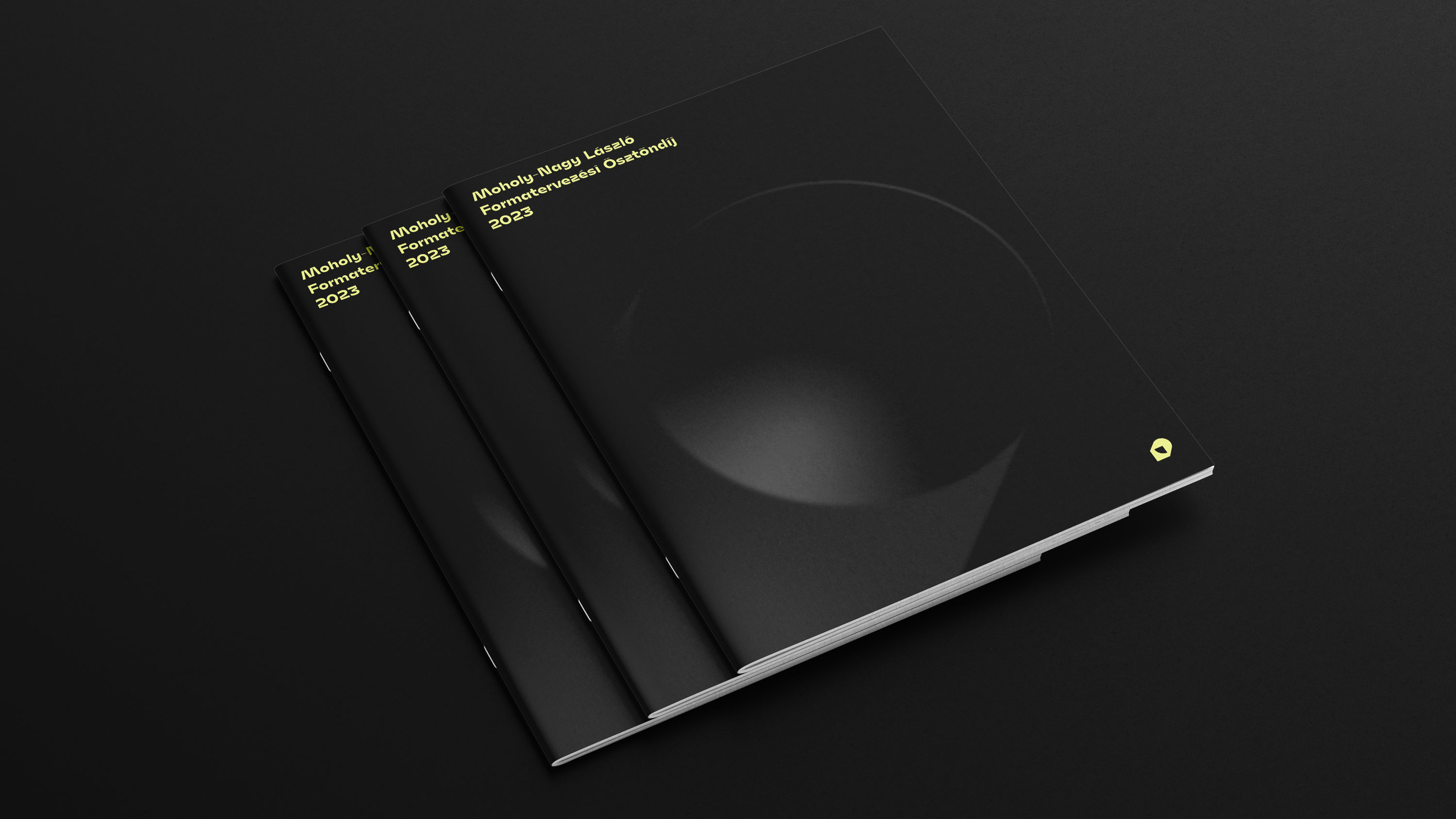
Moholy-Nagy Design Grant 2023
For the fourth year in a row, I am able to redesign the visual identity of the Moholy-Nagy László Design Grant. The visual identity of this year's call for applications is completed through a combination of the logo created by @hungarumlaut and textures inspired by Moholy's photograms.

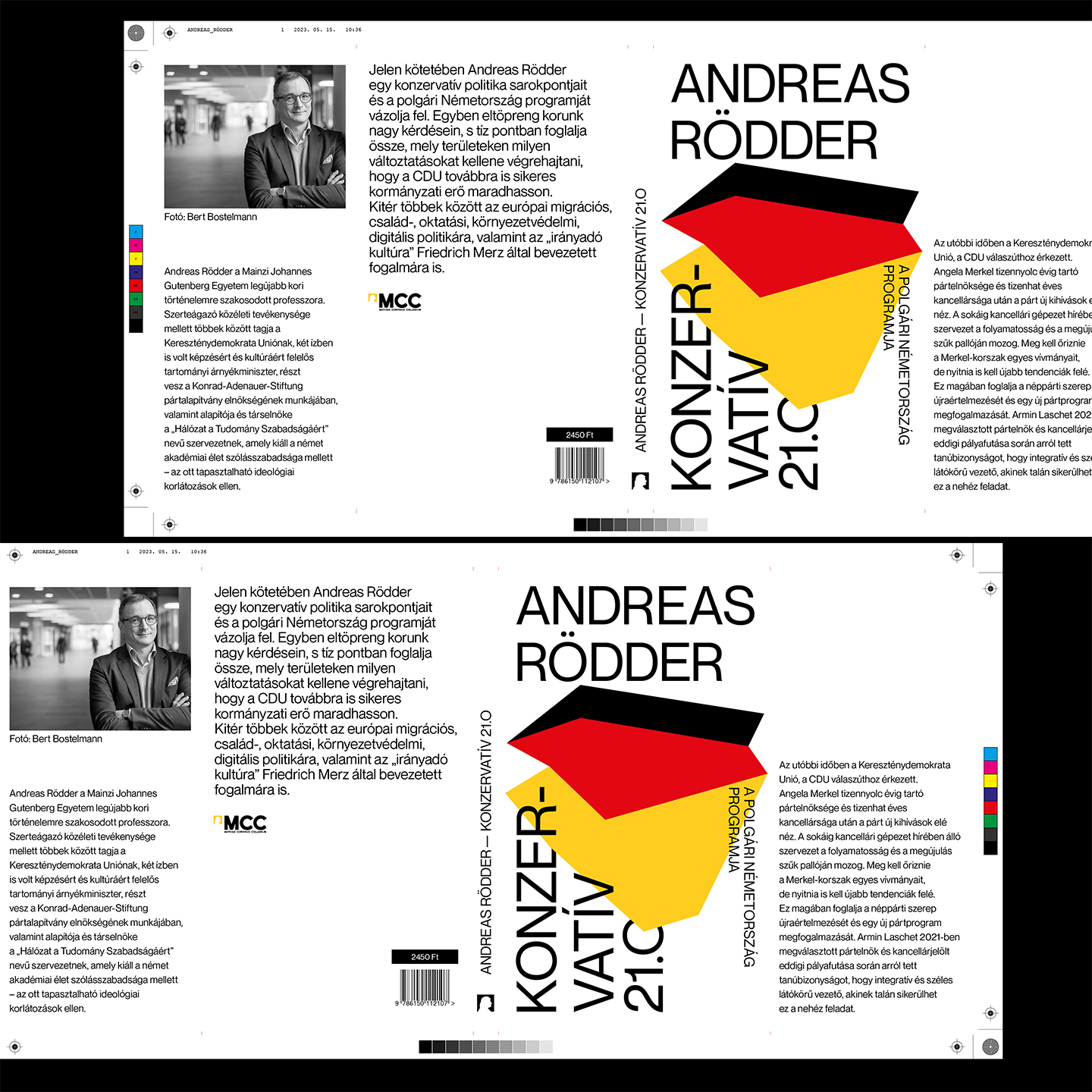
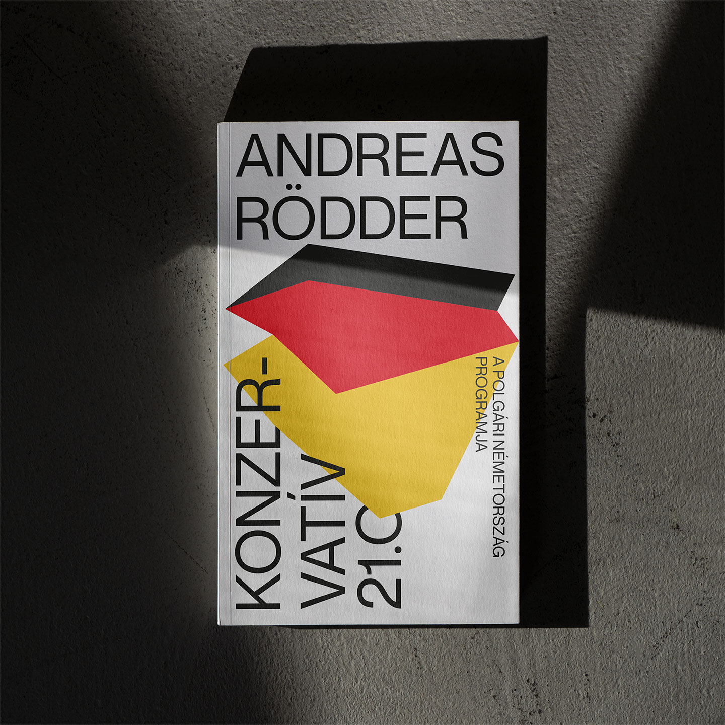
Andreas Rödder
In this volume, Andreas Rödder outlines the cornerstones of conservative politics and the program of bourgeois Germany. He also reflects on the major issues of our time and summarizes in ten points which areas require changes in order for the CDU to remain a successful governing force. Among other things, he addresses European migration, family, education, environmental, and digital policies, as well as the concept of the "guiding culture" introduced by Friedrich Merz.
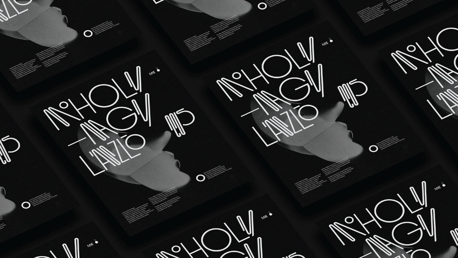
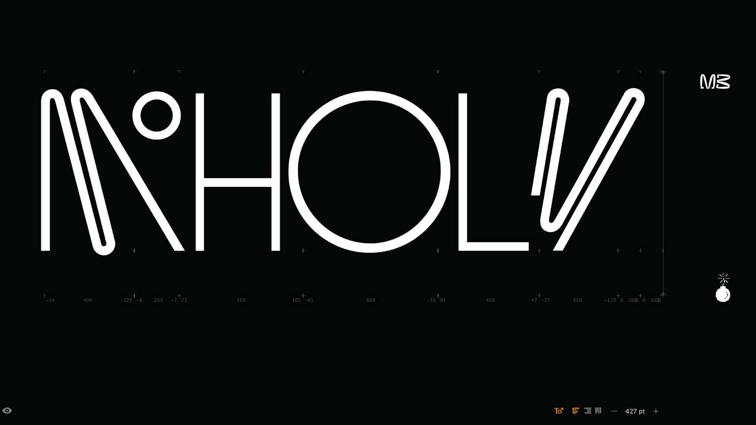
Moholy-Nagy 125
The Moholy-Nagy 125 Hommage exhibition was a celebration of the legacy of one of Hungary's most important artists and educators. Participating in such a prestigious event was a great honor for me and allowed me to showcase my work alongside some of the best graphic designers in the country.
My custom lettering and poster were designed to pay tribute to Moholy's innovative approach to typography and design. I wanted to create something that was experimental and daring, yet still respectful of Moholy's legacy. By incorporating elements of the Bauhaus style, I was able to create a piece that was both timeless and contemporary, while also paying homage to one of the most influential art movements of the 20th century. The exhibition itself was a showcase of creativity and ingenuity, with each exhibitor bringing their unique perspective to Moholy's oeuvre. It was inspiring to see the variety of styles and approaches on display, and I felt privileged to be a part of such a talented group of designers. The event was a great success and drew visitors from all over Hungary, as well as from abroad, further underscoring the importance and relevance of Moholy's legacy.
My custom lettering and poster were designed to pay tribute to Moholy's innovative approach to typography and design. I wanted to create something that was experimental and daring, yet still respectful of Moholy's legacy. By incorporating elements of the Bauhaus style, I was able to create a piece that was both timeless and contemporary, while also paying homage to one of the most influential art movements of the 20th century. The exhibition itself was a showcase of creativity and ingenuity, with each exhibitor bringing their unique perspective to Moholy's oeuvre. It was inspiring to see the variety of styles and approaches on display, and I felt privileged to be a part of such a talented group of designers. The event was a great success and drew visitors from all over Hungary, as well as from abroad, further underscoring the importance and relevance of Moholy's legacy.
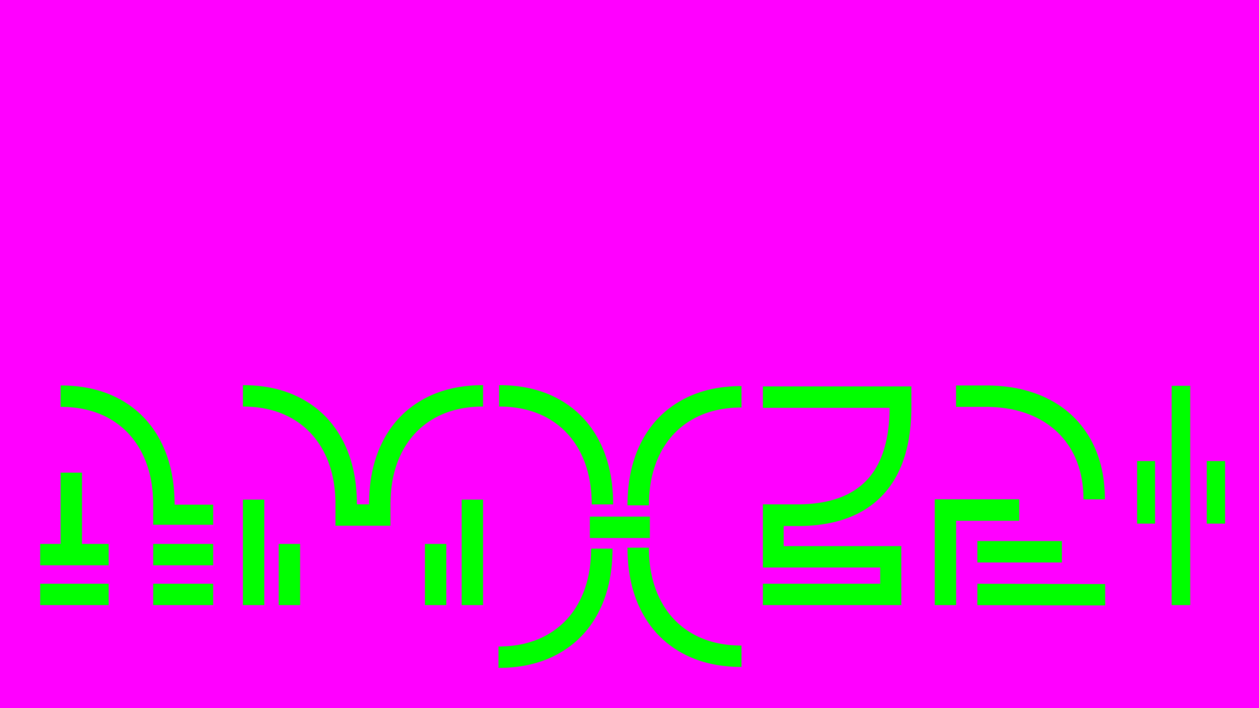
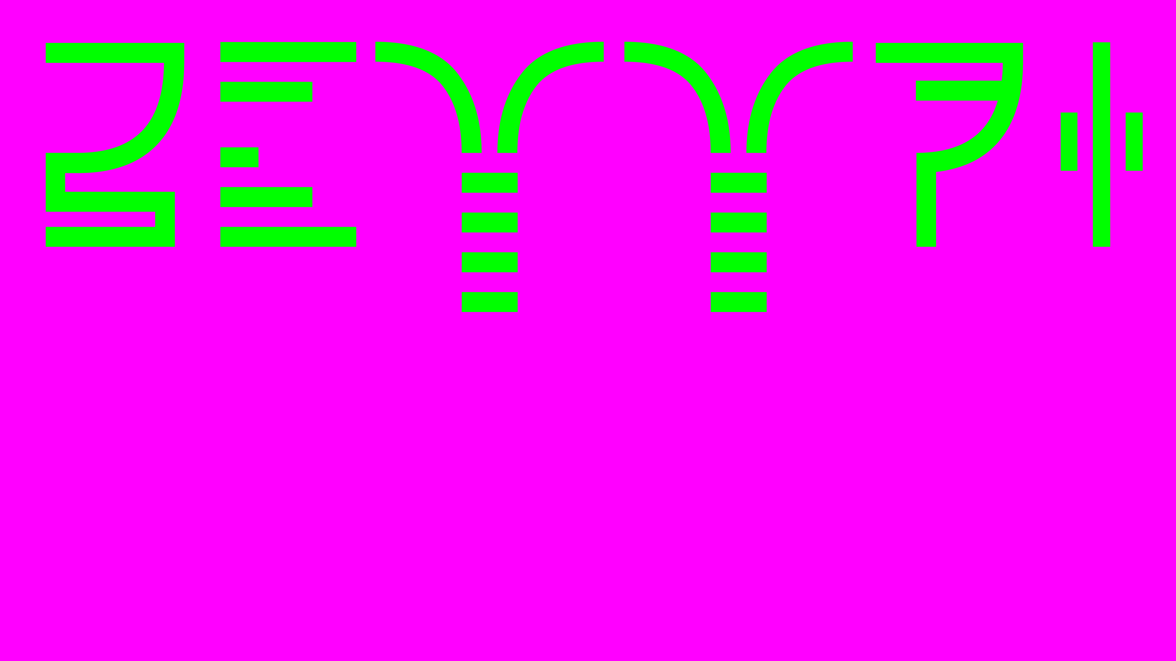
I can’t figure any catchy name for this type
Progress typeface is a font that draws inspiration from the neon signatures of the Loki series, a popular Marvel TV show. The typeface has a distinct futuristic and technological look, with sleek lines and sharp edges that give it a modern and dynamic feel.
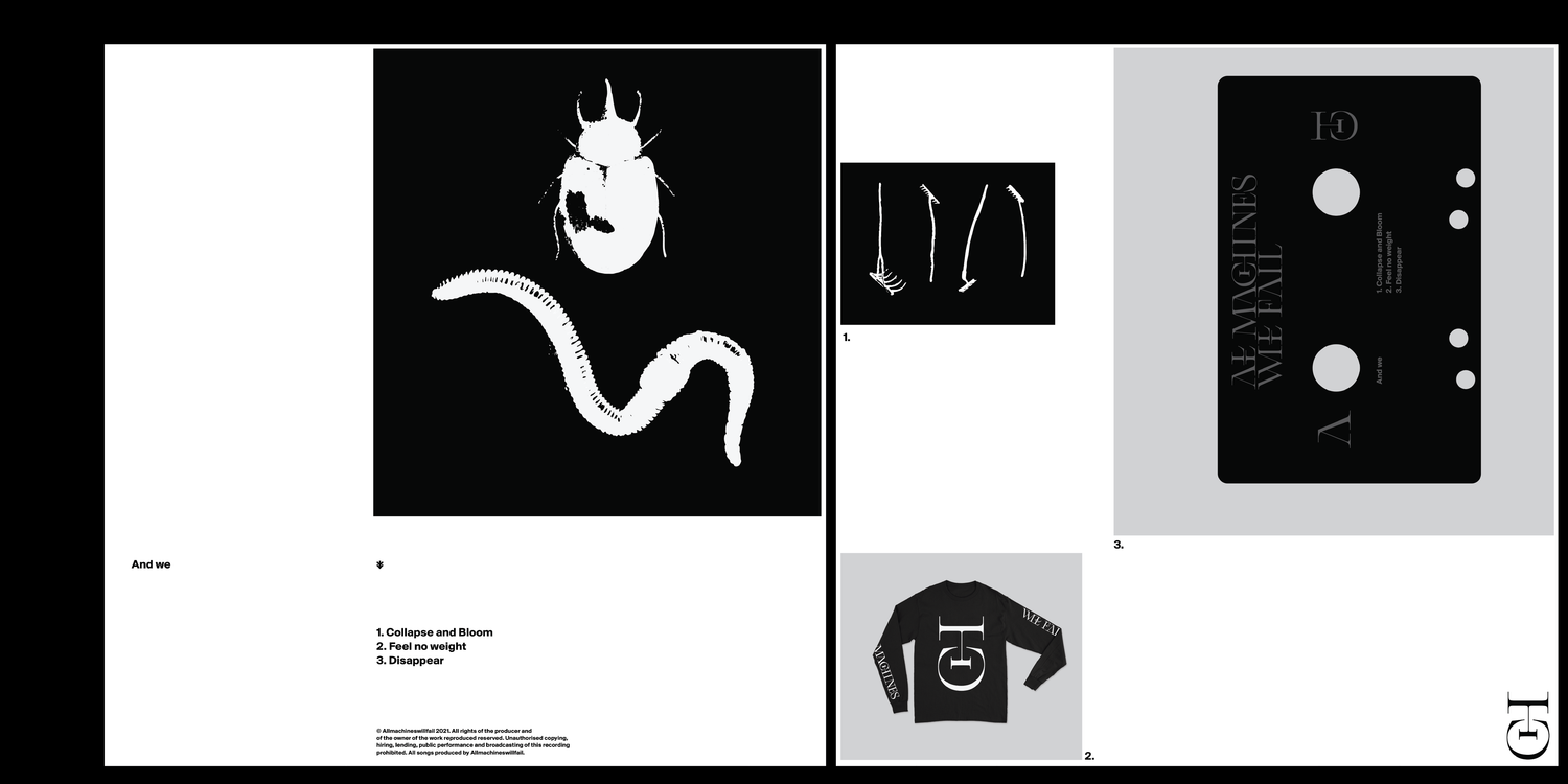
All Machines Will Fail
One of my friends' latest musical experiments blends the boundaries of doom metal and raw instruments in an audio-visual experience. When designing the branding, it was important for us to draw inspiration from the shapes of sacred and religious symbols, but without making them too recognizable or direct. The logo features various ligatures, with vertically doubled characters inspired by the orthodox iconostases.
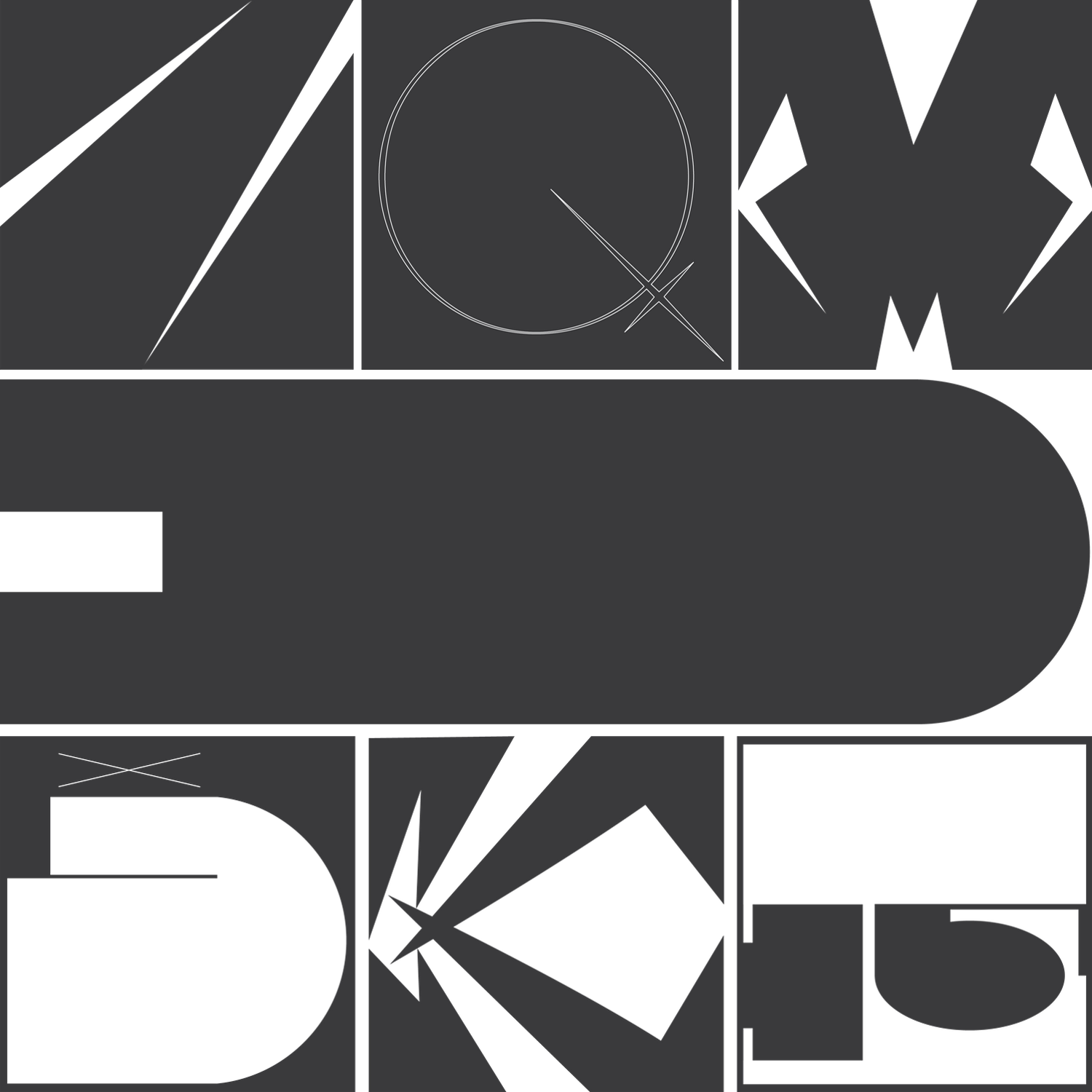

How to fail in the 36 days of type
I don't think anyone needs an introduction to the 36daysoftypes challenge. The advantage is that you have 1 or 2 hours of free time every day to design a character for 36 days. The difficulty, however, is that many people don't have that much time during the week. I belong to the latter group, so only a part of this typeface was created as a result.

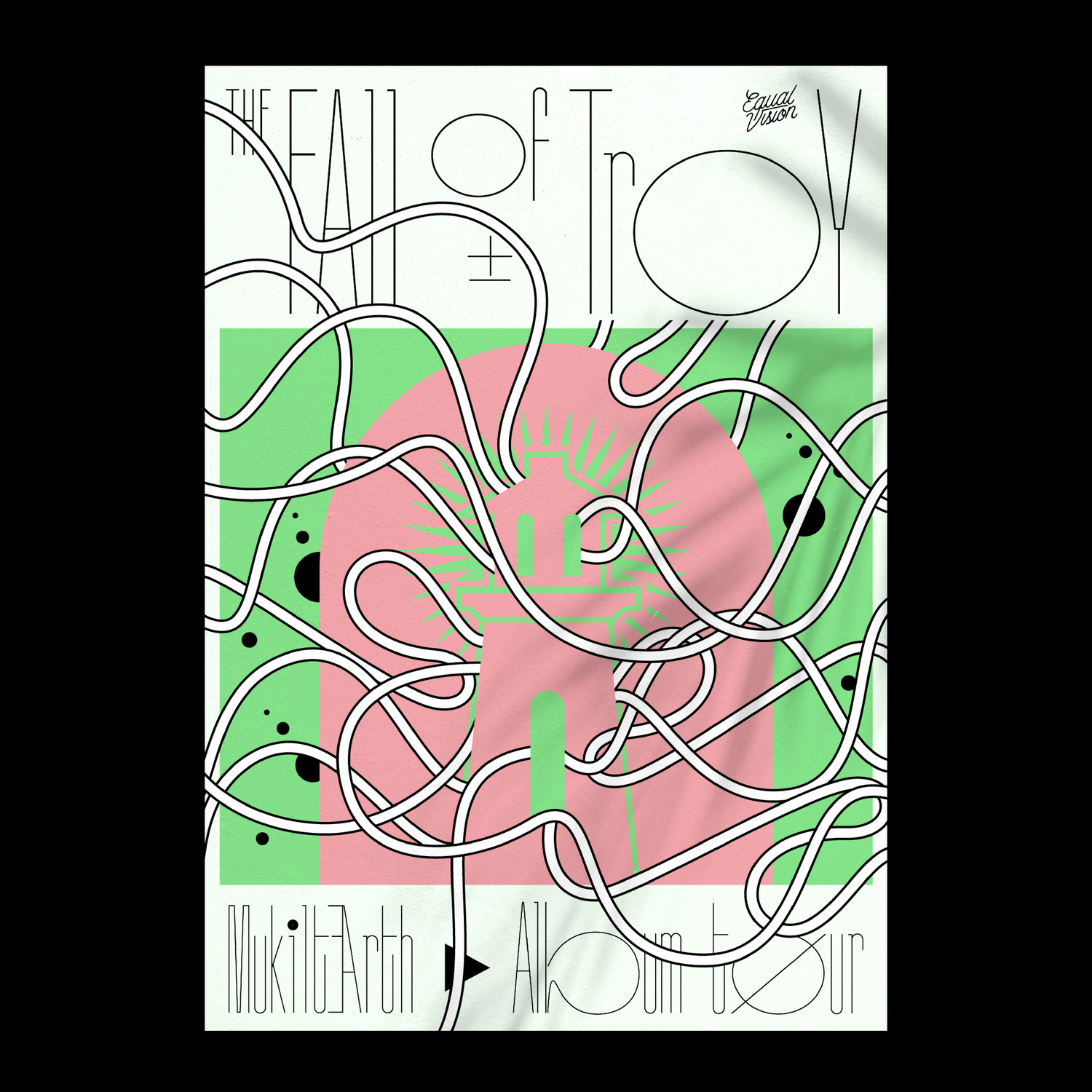
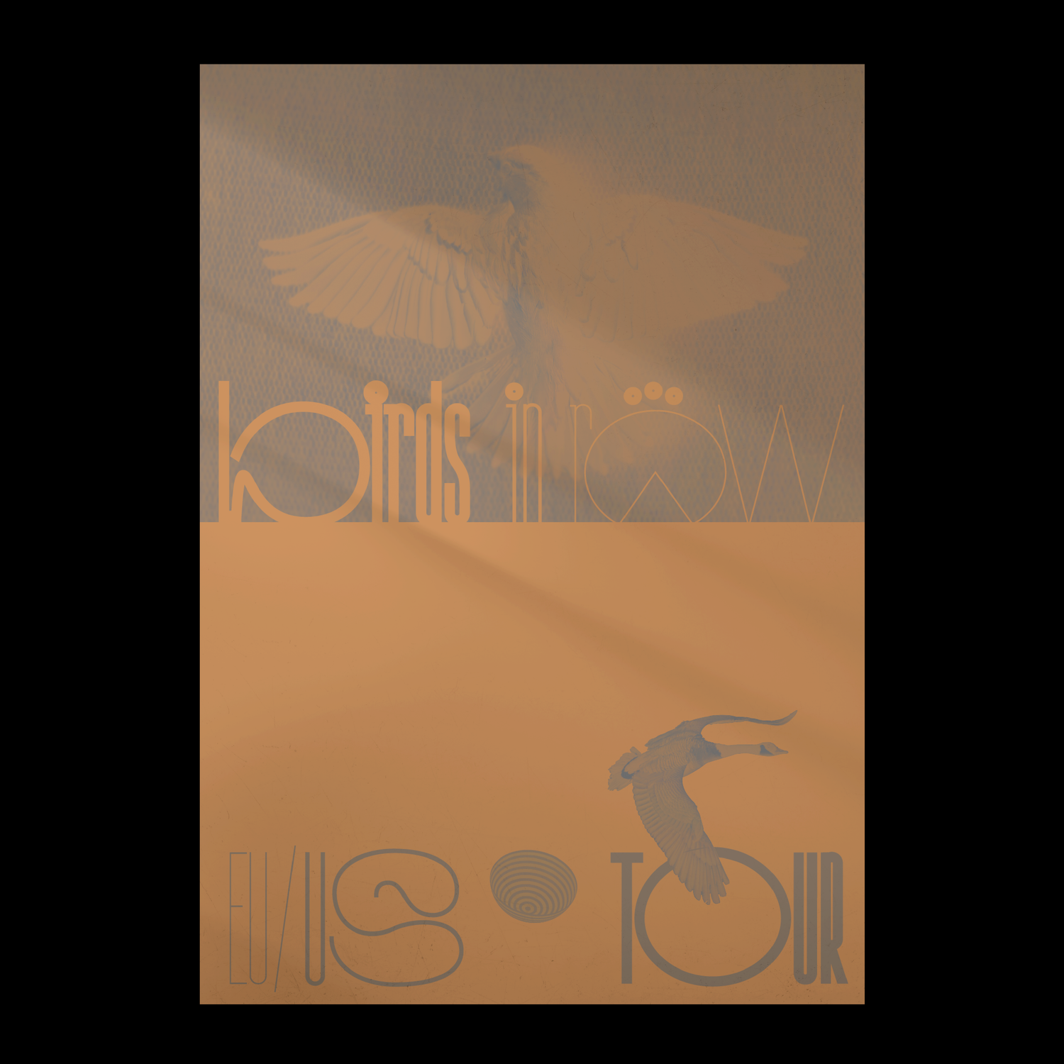
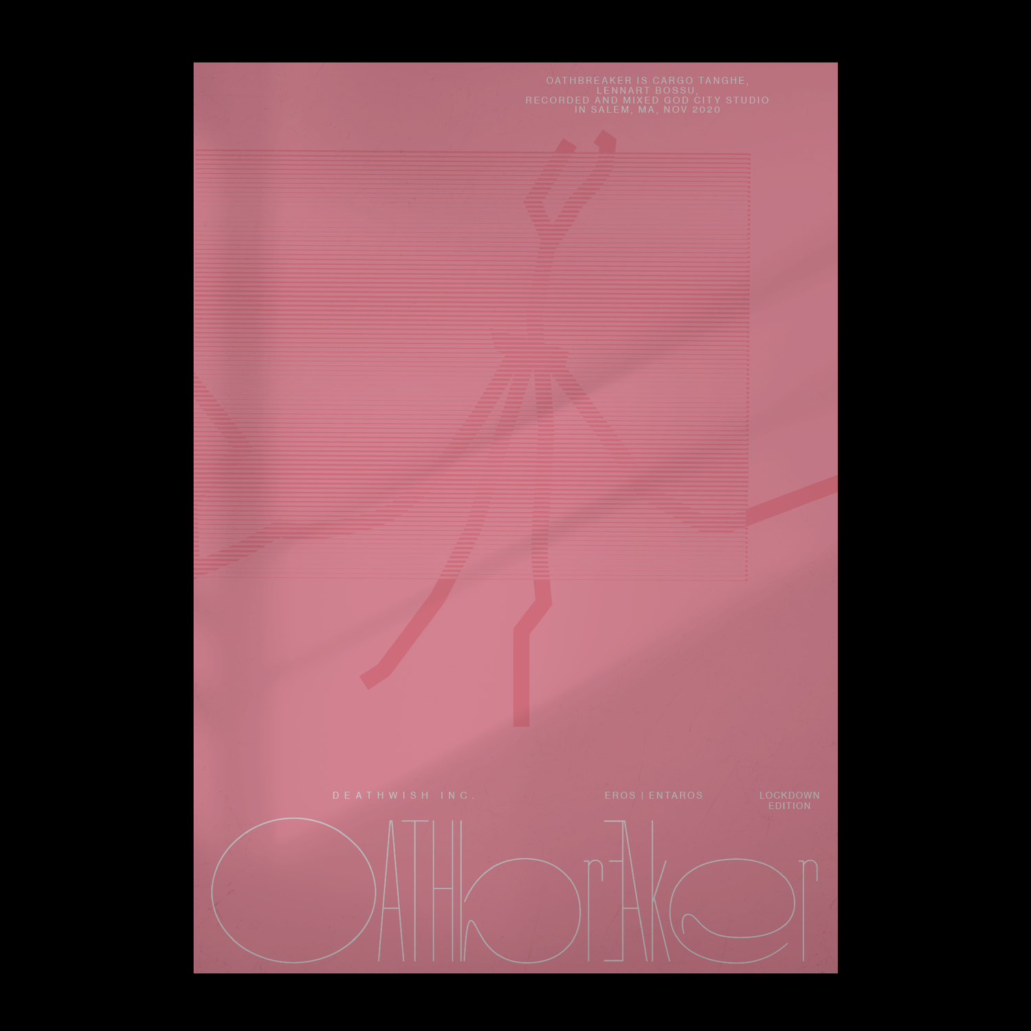
Testing a progress typeface
I experimented with a typeface where most consonants are given extreme width. These function as alternative characters, so they can be freely varied.
I thought the best way to showcase them was to create fictional posters for my most listened-to bands. The atmosphere of these bands' music was a perfect inspiration to design these posters.
DMD 2019
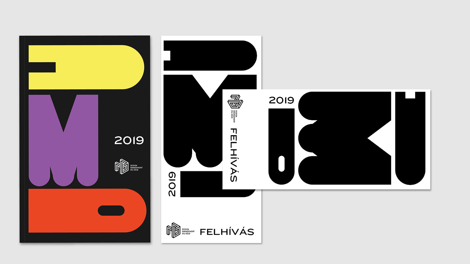
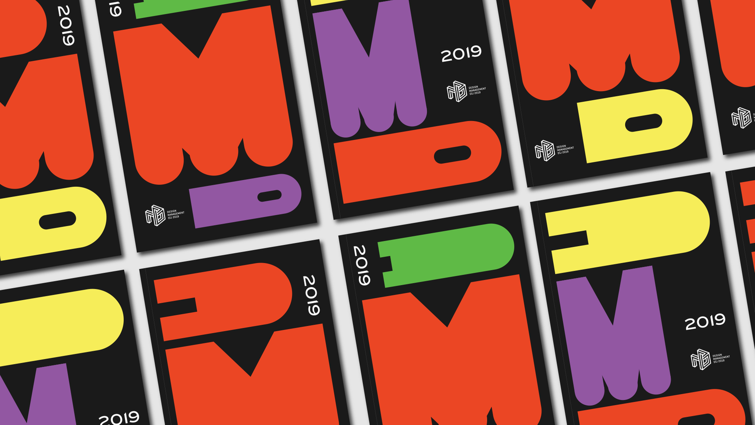
The Hungarian Design Management Díj (DMD) has recently undergone a significant visual identity overhaul with the introduction of a new concept that utilizes responsive lettering. The dynamic lettering system is the backbone of the new visual identity, providing a flexible and adaptive framework that can be scaled both horizontally and vertically, creating a versatile visual language that is perfect for a range of applications. This approach to lettering design allows the DMD brand to stay current and relevant in a rapidly evolving design industry, while also maintaining a strong and consistent identity.
The new DMD visual identity also features redefined brand colors that can be easily varied and used as both one-tone and duo-tone options. This color system provides designers with even more flexibility when working with the DMD brand, allowing them to create compelling designs that are both visually striking and highly effective.
Overall, the new DMD visual identity is a bold and exciting update that captures the essence of the organization while also positioning it for future success. With its flexible lettering system and versatile color palette, the DMD brand is sure to make a strong impression on designers and design enthusiasts alike.
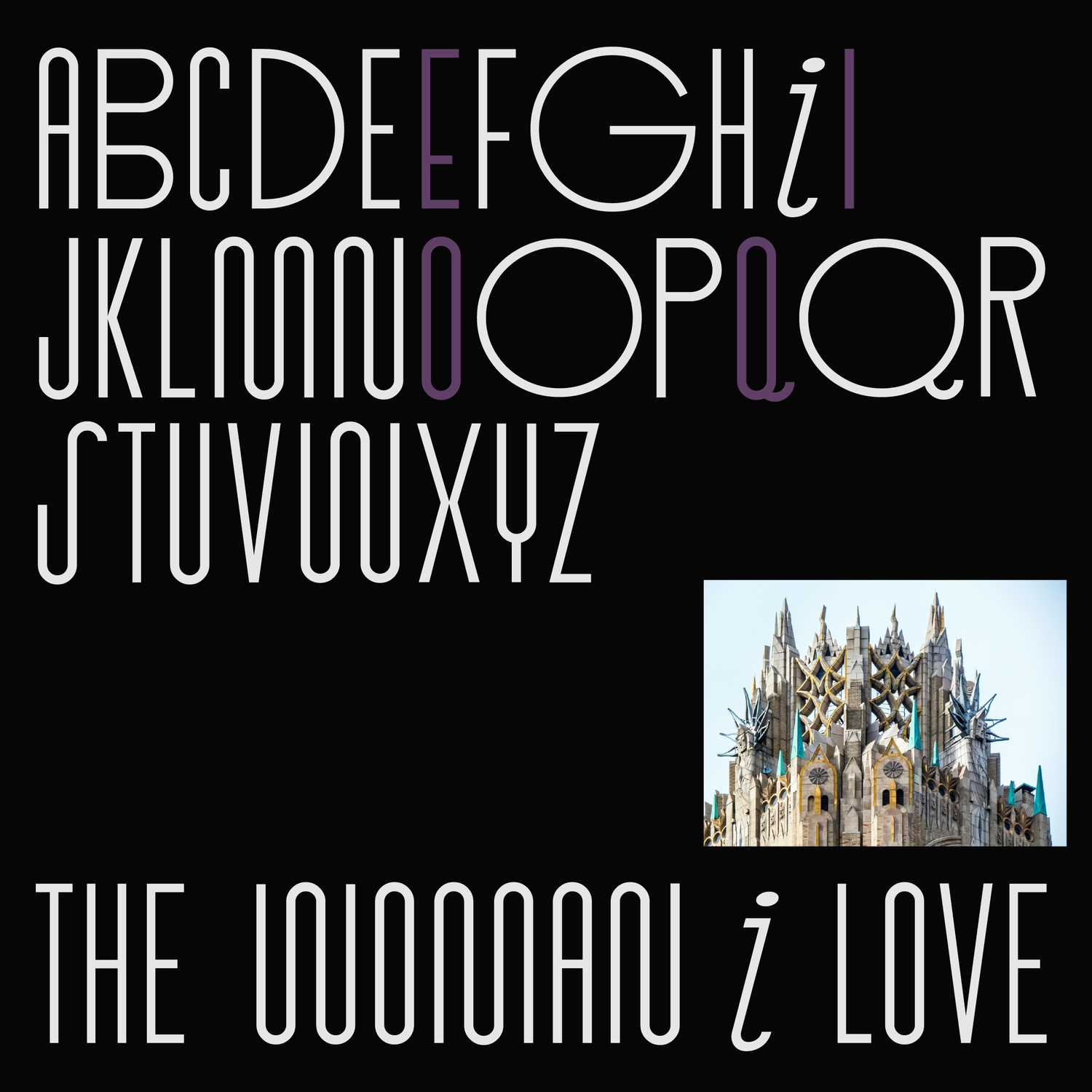
The logo features a flowing, abstract shape that echoes the curves and fluidity of Pilates movements. The shape is balanced and symmetrical, with a strong, centered composition that conveys stability and strength. The custom typeface is inspired by the classic art deco style, with its bold lines, geometric shapes, and intricate details. The typeface is clean, modern, and easy to read, yet it also has a timeless quality that adds depth and character to the bra
Jumping Mono
Jumping Mono is a unique and innovative variable typeface that features a jumping x-height, giving it a distinctive appearance. The typeface is designed with straight lines and angles, without any curves or arcs, which gives it a modern and minimalist feel. The variable feature allows users to adjust the x-height, giving them greater flexibility and control over the typography. This typeface is perfect for use in designs where a bold and striking look is desired, such as in titles and headlines. With its unique design and variable capabilities.
Jumping Mono is a unique and innovative variable typeface that features a jumping x-height, giving it a distinctive appearance. The typeface is designed with straight lines and angles, without any curves or arcs, which gives it a modern and minimalist feel. The variable feature allows users to adjust the x-height, giving them greater flexibility and control over the typography. This typeface is perfect for use in designs where a bold and striking look is desired, such as in titles and headlines. With its unique design and variable capabilities.
COVID GAMES
During the long weeks of lockdown we thought about reflecting on the situation caused by covid-19. We combined our passion for graphic design, motion graphics and old arcade games to create a series of fictional games. Each game is based on a particular topic closely related to the pandemia. Fo example, you have to fight with the Covid boss, as a vaccine spaceship, or just avoid any connection with people.
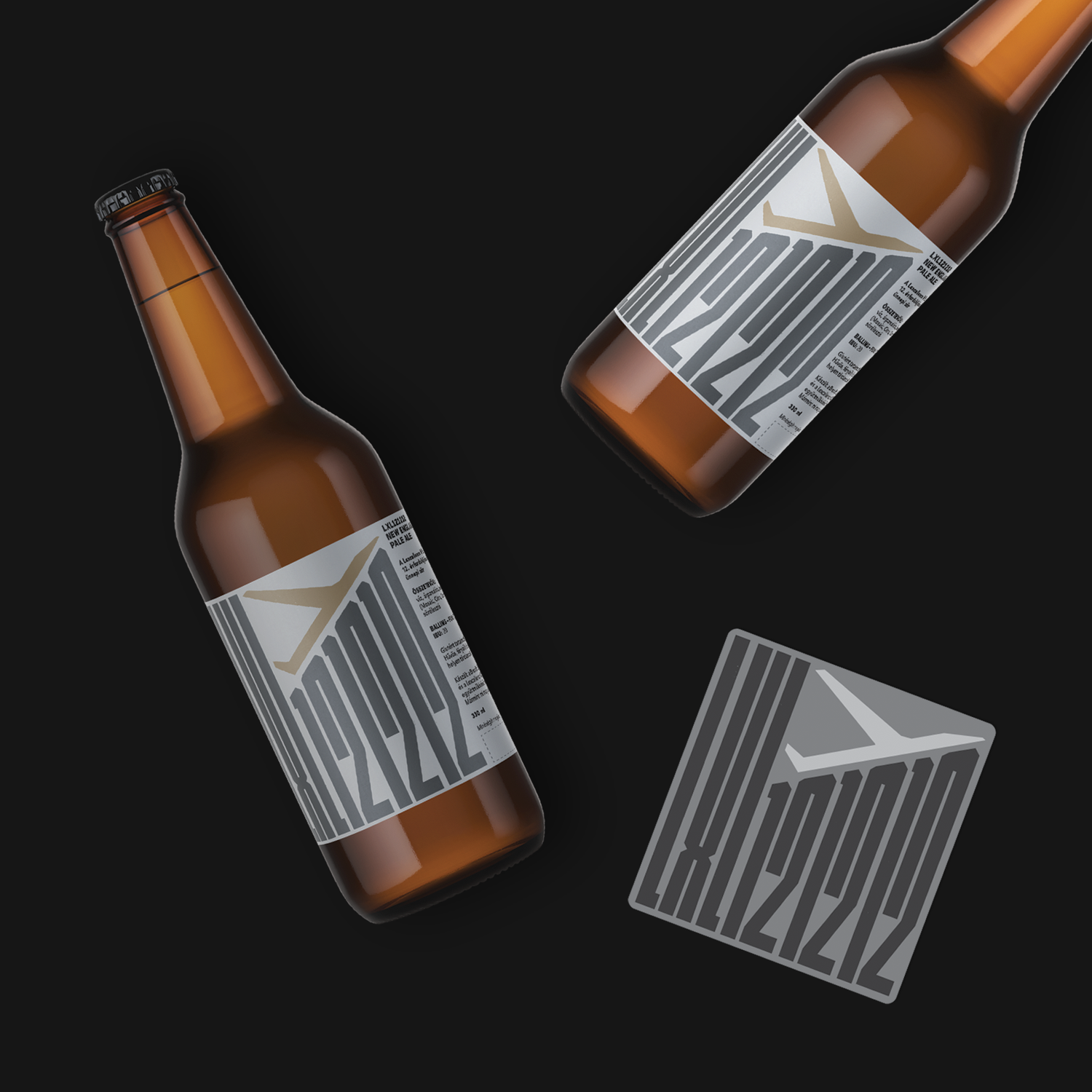
We design a new beer label every year for Lexcellence Community Lane and Regulatory Consulting Ltd. This year marks the 12th label in the series, and as with previous years, we created a unique fantasy name for the beer that is based on the chassis number of airplanes. Given the theme, it was important to design lettering that conveyed strength and an industrial feel to match the overall aesthetic of the label.
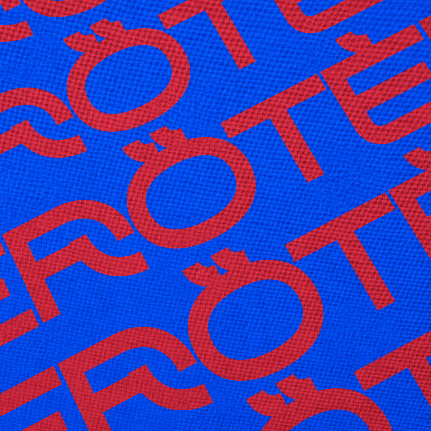
We developed a brand new identity for a fitness gym that offers a range of classes such as TRX, CrossFit, and Cross Core. Unfortunately, they recently changed their name to Red Plate. Despite the name change, the gym's visual identity remained consistent and striking, with a bold and energetic color scheme and typography that conveyed the strength and intensity of their workouts.
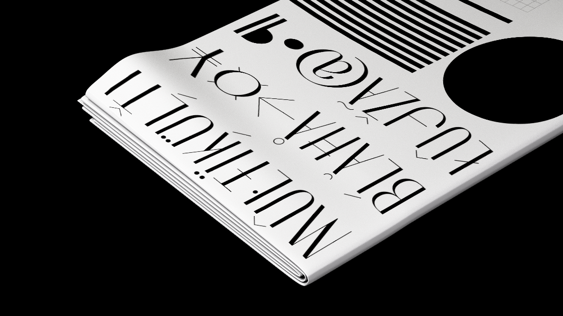
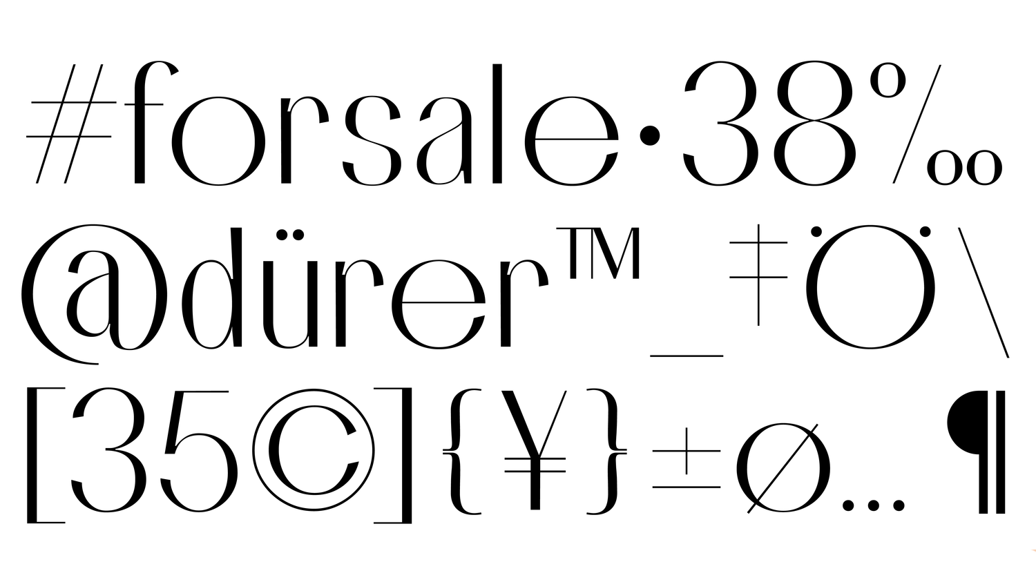
FOR SALE
This refers to a typeface that combines different levels of stroke contrast within the same design. Typically, a sans serif typeface has a uniform stroke width, meaning that all the vertical and horizontal lines are of the same thickness. However, a mixed contrasted sans serif typeface can introduce some variation in the stroke width, either by using different weights.

MFT - Annual Report
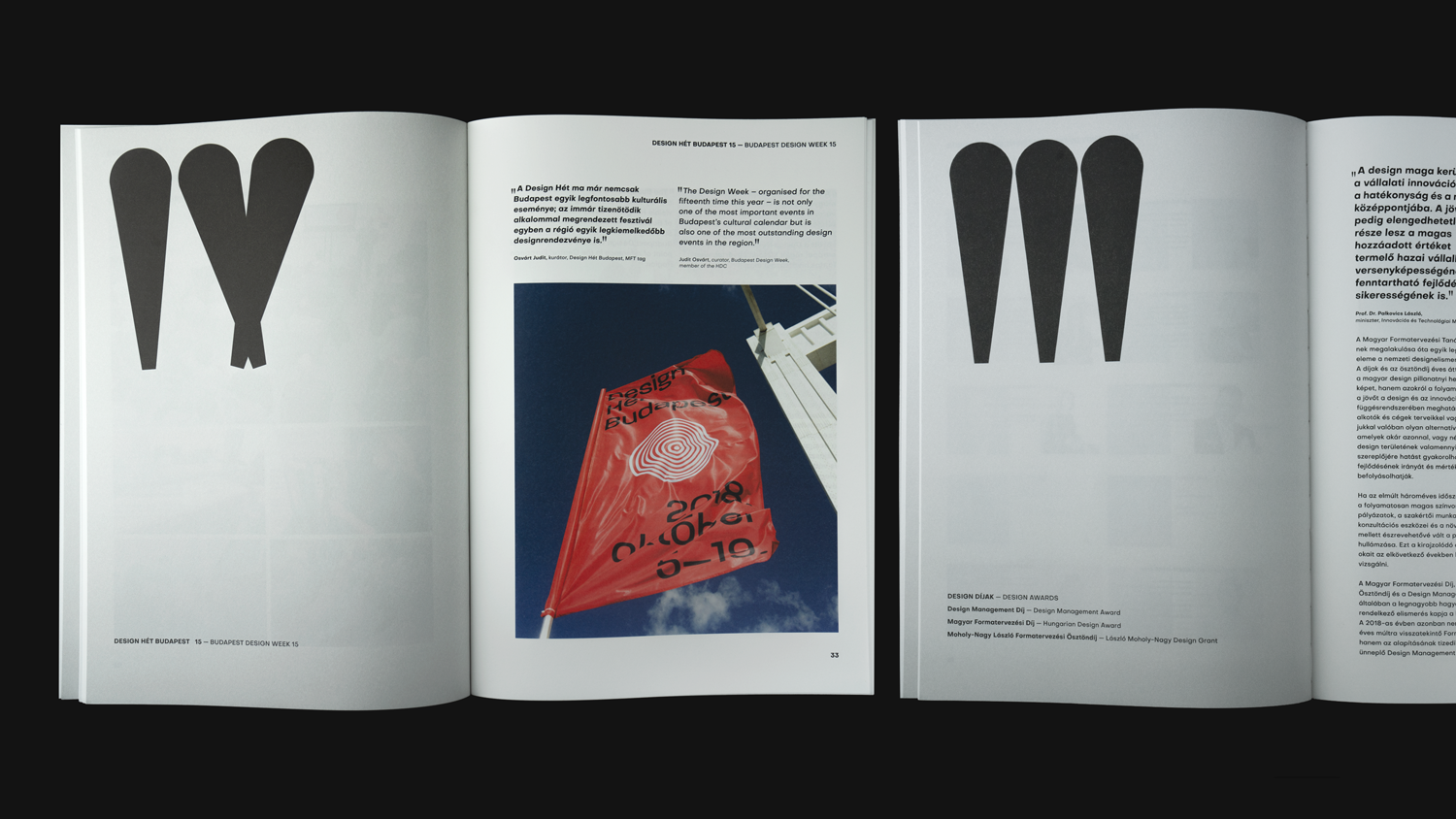
Layout design and custom typafe fot MFT - Annual Report 2018. The work of the closing year of a three-year programme cycle must primarily be assessed in the context of previously stipulated objectives and plans, and its achievements evaluated in the context of the future. Hence, the cornerstones and directions set by the programme must be reviewed here. The most important general goal the Hungarian Design Council set itself was to further deepen the relations between the economy and design between 2015 and 2018 and to strengthen the connection between design and technology. These results are summarized by this catalogue.

Abraham Typeface (Progress)
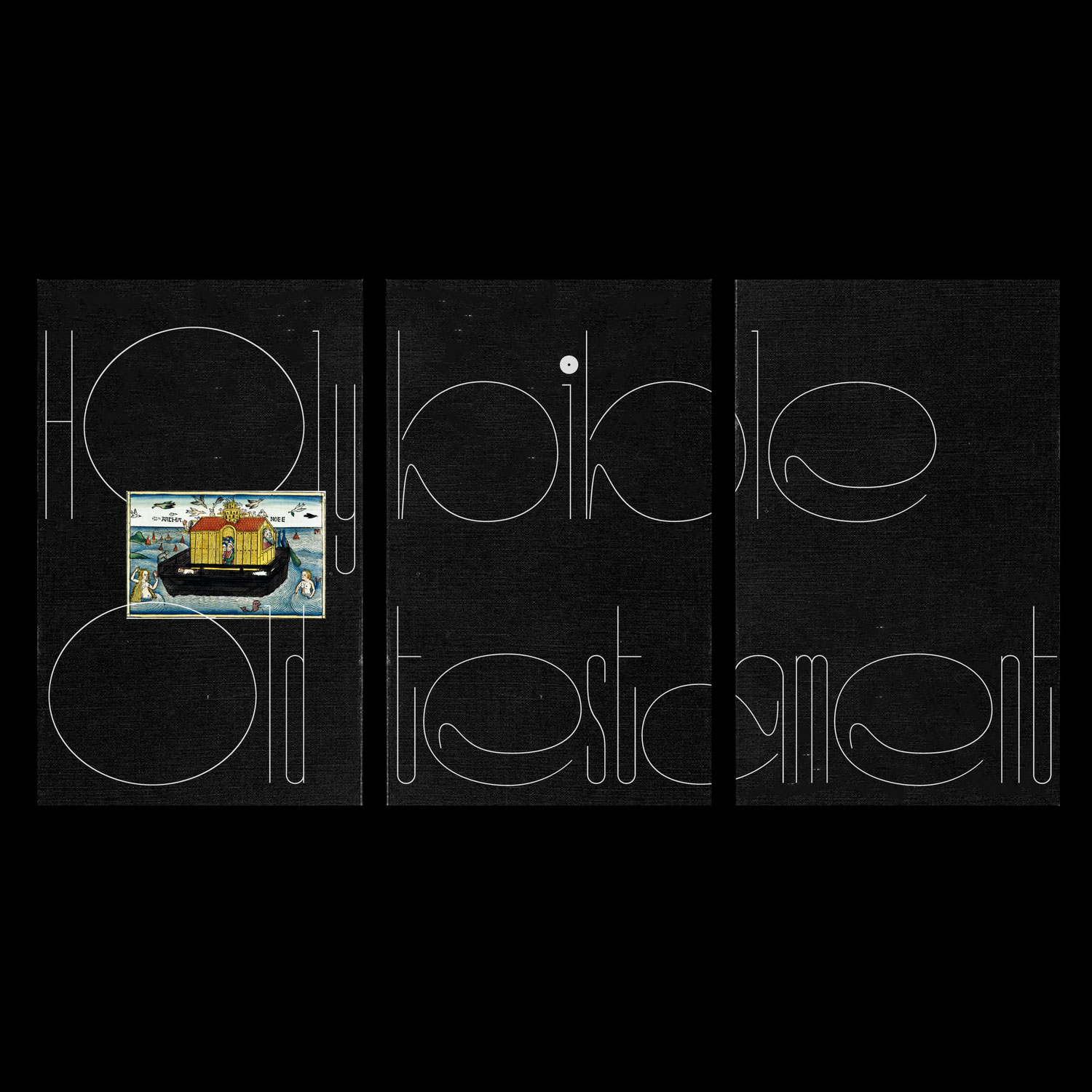
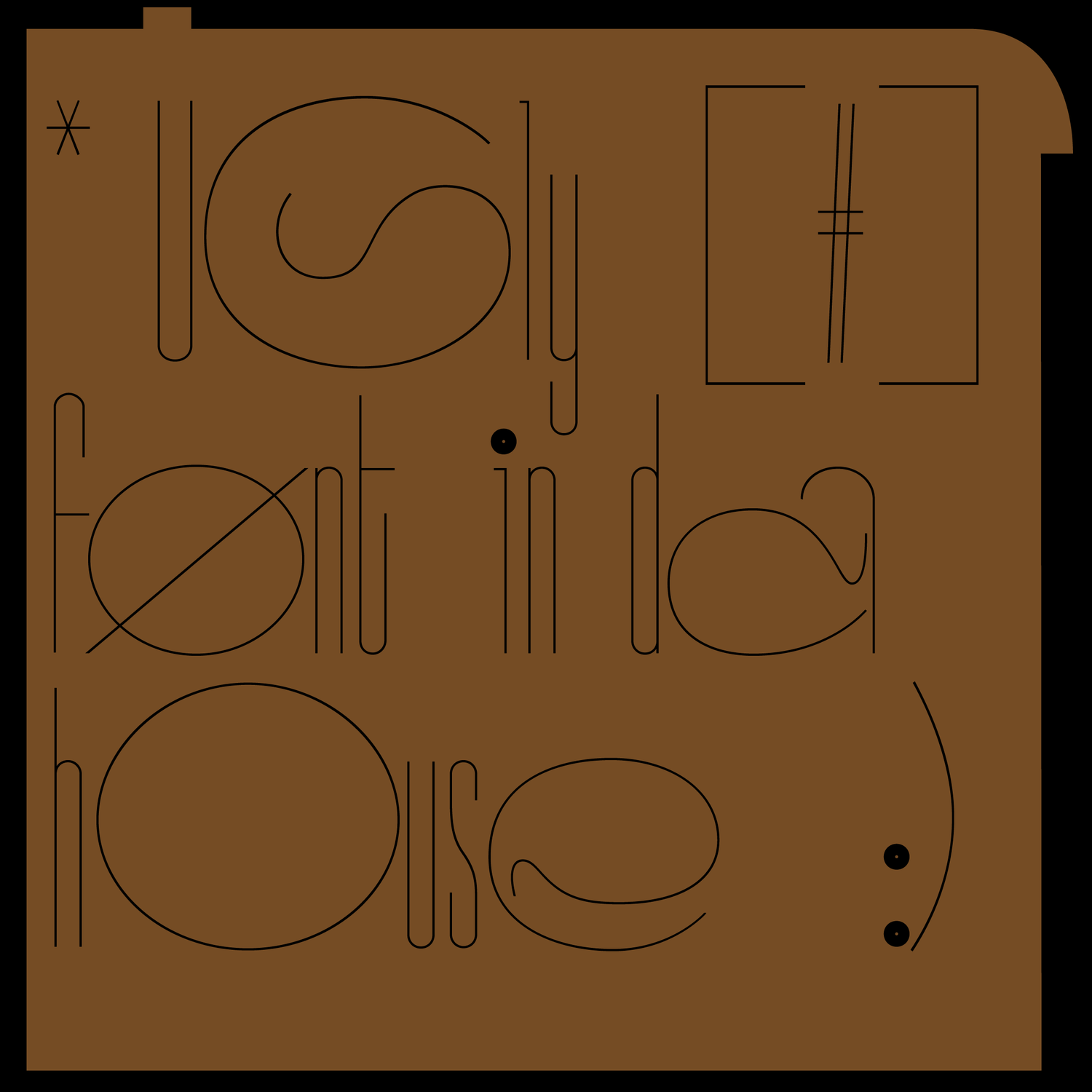
An unfinished typeface based on switching the width of alternative characters is an interesting concept in typography that involves creating a font with variable width characters that can be switched out to create unique and dynamic typography. This typeface is typically created by designing multiple versions of each letter with varying widths, and then assigning each version a specific code or keystroke that allows users to switch between them while typing. The result is a font that can create a variety of visual effects and can be customized to suit different design needs.
DENSO SANS
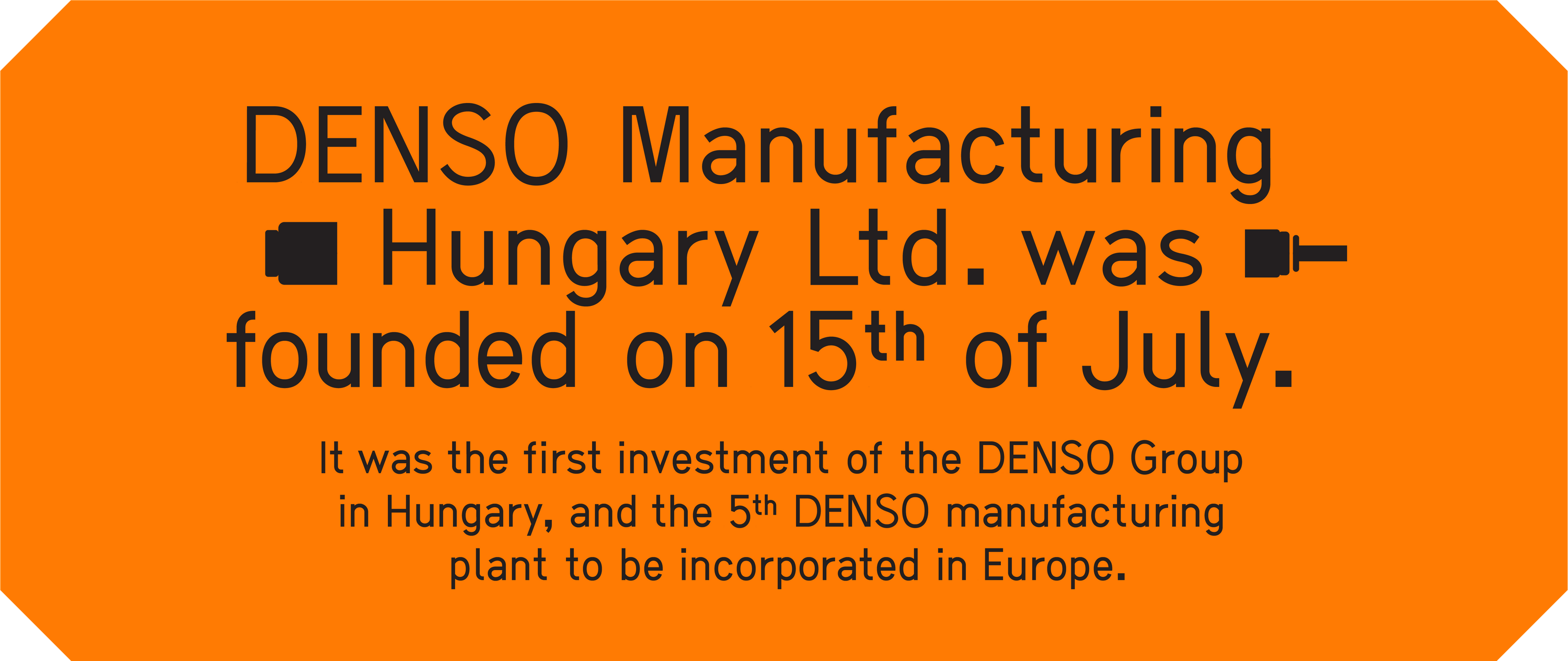
Denso Manufacturing Hungary Ltd. was established in 1997 and is located in Székesfehérvár. It was the firt investment of the international Denso Group in Hungary, and the 5th Denso manufacturing plant to be incorporated in Europe. The company started business with diesel injection pumps but has experienced rapid growth and now manufactures a wide range of powertrain management products.
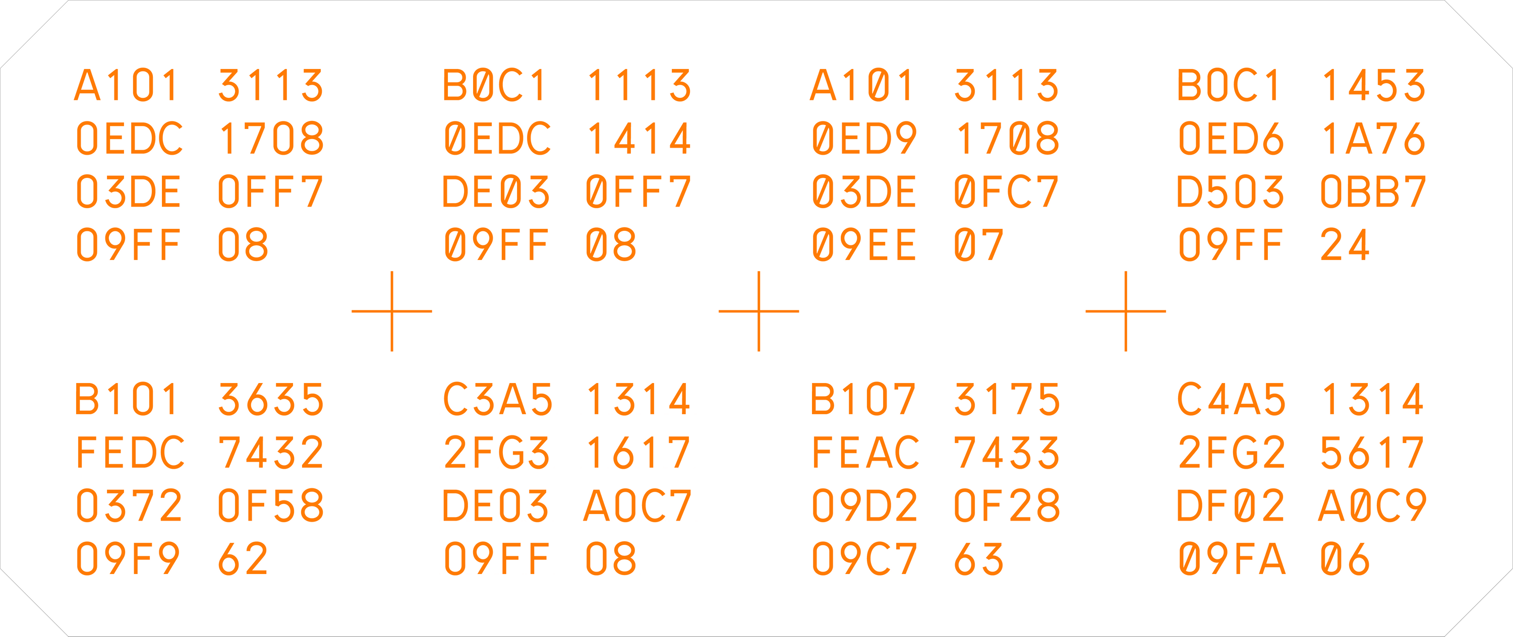
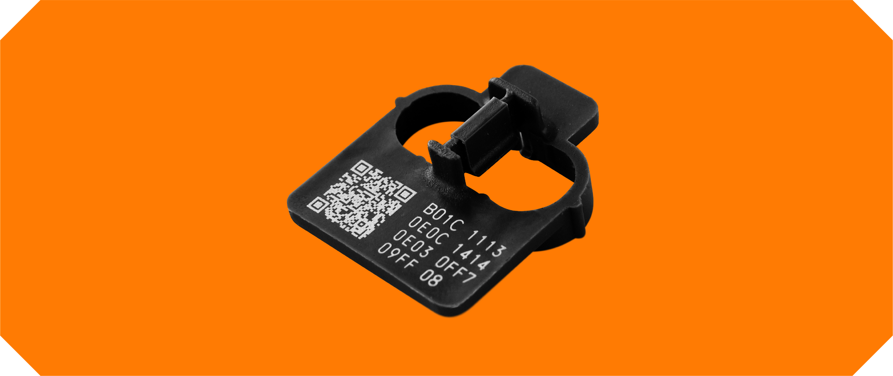
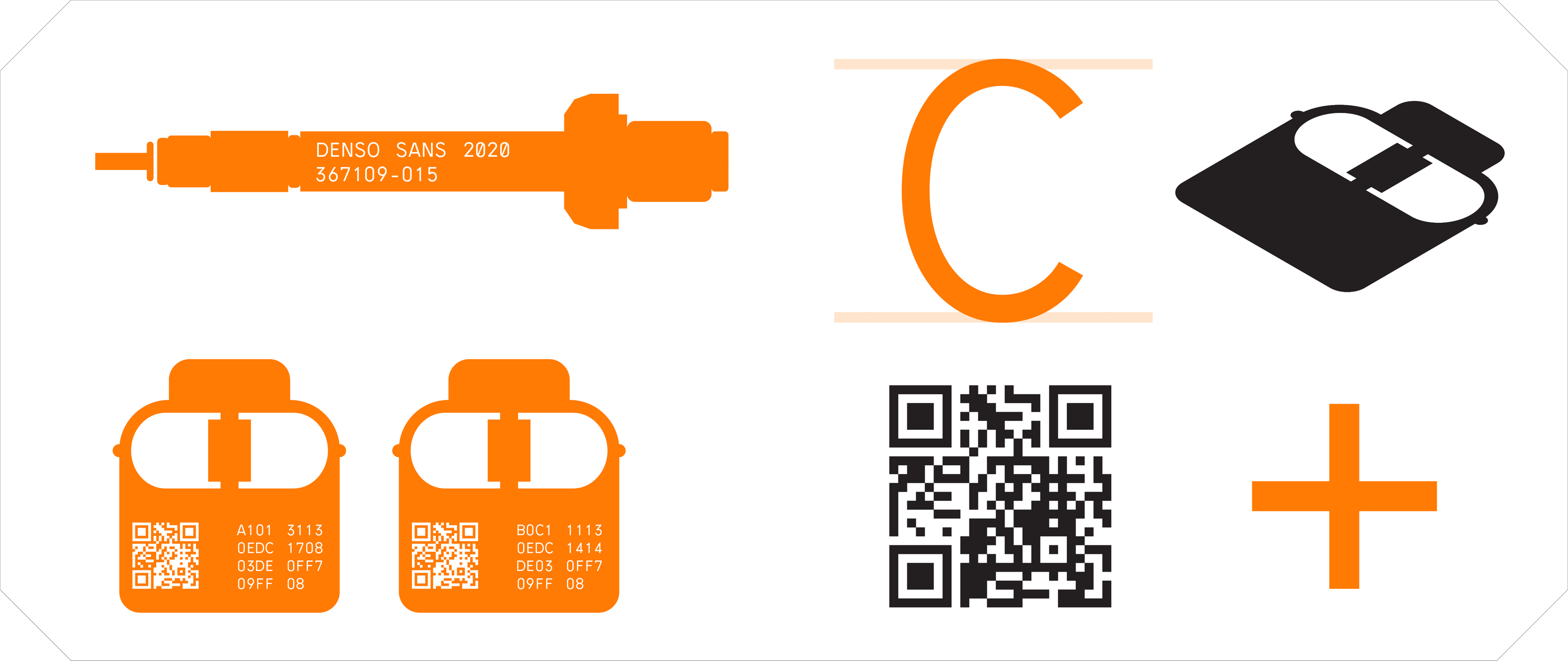
Denso Sans is a custom sans serif typeface that was based on an old scanned drawing from the '70s. We were commissioned to digitalize and redesign the font to meet the expectations of the 21st century. Our task was to make the typeface work efficiently on the company's laser engraving tools. The biggest challenge was to maintain the font's legibility in super small sizes because it's mostly used as serial numbers and technical information on the company’s own industrial products. Genre: type engineering w/ @tamaskosa
Denso Sans is a custom sans serif typeface that was based on an old scanned drawing from the '70s. We were commissioned to digitalize and redesign the font to meet the expectations of the 21st century. Our task was to make the typeface work efficiently on the company's laser engraving tools. The biggest challenge was to maintain the font's legibility in super small sizes because it's mostly used as serial numbers and technical information on the company’s own industrial products. Genre: type engineering w/ @tamaskosa
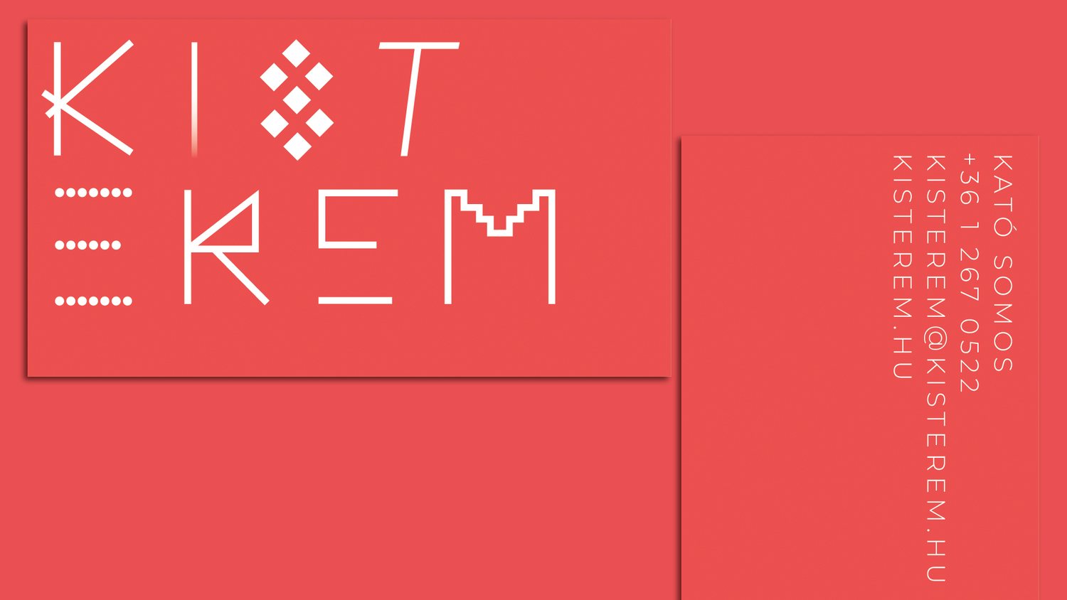
kisterem gallery
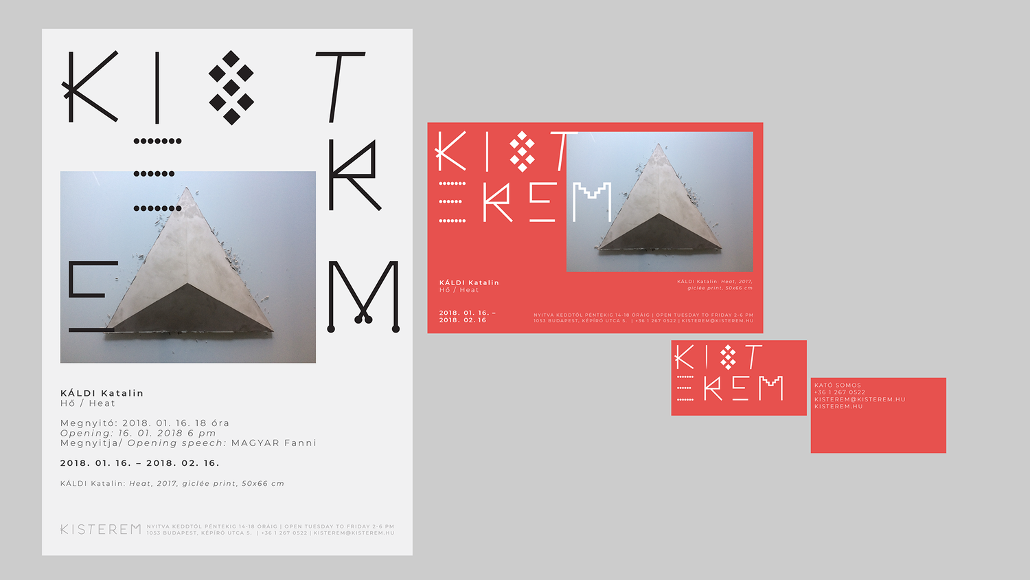
The Kisterem Gallery in Budapest has recently undergone a transformation with the creation of a new brand identity concept. This identity was designed to give the gallery a fresh and modern look that reflects its commitment to showcasing contemporary art.
To achieve this goal, a custom variable font was created by a designer. This font is unique to the Kisterem Gallery and allows for flexibility and dynamism in the gallery's branding efforts. The variable font can be adjusted and adapted to suit different applications, making it a versatile tool for the gallery to use across a range of mediums.
To achieve this goal, a custom variable font was created by a designer. This font is unique to the Kisterem Gallery and allows for flexibility and dynamism in the gallery's branding efforts. The variable font can be adjusted and adapted to suit different applications, making it a versatile tool for the gallery to use across a range of mediums.
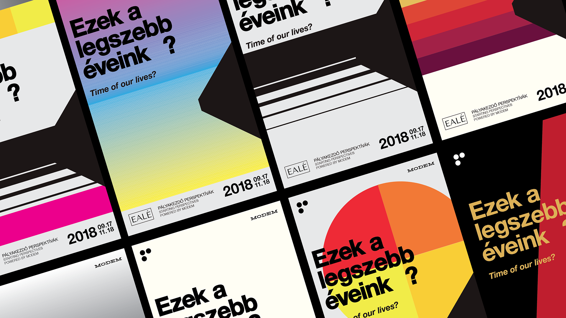
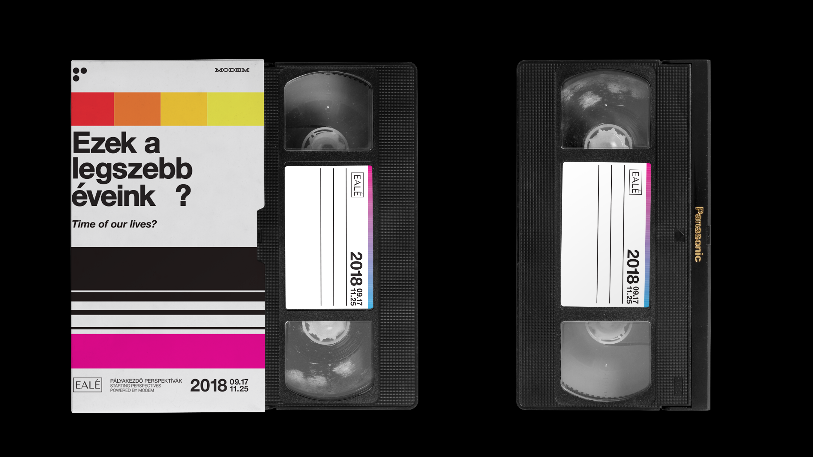
Ezek a legszebb éveink?
The exhibition showcases the works of young Hungarian artists who have graduated from an art university within the past five years. It is not only an exhibit of contemporary artworks, but also an opportunity to gain insight into the challenges faced by young artists.